
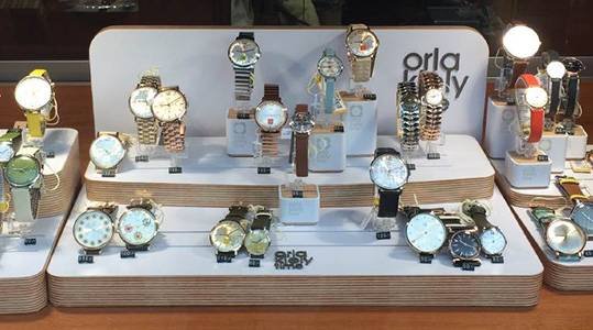
In luxury retail, a brand is not defined only by its products but also by how those products are presented. For watch retailers in particular, store design and visual merchandising play a central role in shaping customer perception. Every fixture, lighting choice, and layout decision contributes to the story a brand is trying to tell.
A thoughtfully designed Watch Store Display acts as a direct extension of brand identity. A carefully planned Watch Store Display communicates values such as luxury, precision, innovation, or tradition through visual cues that customers experience the moment they enter the store.
The Connection Between Display Design and Brand Identity
Brand identity is more than a logo or color scheme—it is the overall impression customers form based on every interaction with the brand. In a physical retail space, displays become one of the strongest tools for expressing this identity.
A watch store display influences brand perception by:
- Reinforcing brand values through materials and design
- Creating emotional connections with customers
- Differentiating the brand from competitors
- Supporting product positioning and pricing strategy
When executed effectively, display design becomes a silent communicator of brand personality.
Material Choices That Communicate Brand Values
Materials used in watch displays are among the most immediate indicators of brand identity. Customers subconsciously associate certain materials with specific qualities.
Common material associations include:
- Glass: transparency, elegance, and modern luxury
- Wood: heritage, warmth, and craftsmanship
- Metal: strength, innovation, and precision
- Marble or stone: exclusivity and high-end sophistication
Luxury watch brands often combine these materials to create a balanced visual identity that reflects both tradition and modernity.
Color Schemes and Emotional Branding
Color plays a significant role in shaping customer perception. The color palette used in watch store displays helps define the emotional tone of the brand.
Typical approaches include:
- Black and gold for luxury and exclusivity
- White and neutral tones for minimalism and elegance
- Deep blues for trust, stability, and sophistication
- Earth tones for heritage and craftsmanship
Consistent color usage across displays strengthens brand recognition and creates a unified retail experience.
Layout Design as a Reflection of Brand Philosophy
The way a store is organized communicates how a brand views its customers and products. A structured, thoughtful layout reflects professionalism and attention to detail.
Different layout styles can reflect different identities:
- Minimalist layouts suggest modernity and simplicity
- Dense, curated displays emphasize richness and variety
- Open layouts communicate transparency and accessibility
- Zoned layouts reflect organization and product segmentation
Each design choice reinforces a specific brand message.
Lighting as a Branding Tool
Lighting is one of the most powerful elements in shaping atmosphere and reinforcing identity. It influences how customers perceive both products and the overall brand environment.
Lighting strategies often reflect branding goals:
- Soft, warm lighting creates a luxurious and inviting mood
- Bright, focused lighting emphasizes precision and detail
- Dramatic spotlighting highlights exclusivity and premium status
- Balanced ambient lighting supports a modern retail experience
When used consistently, lighting becomes part of the brand’s visual language.
Product Presentation and Storytelling
How watches are arranged within a display reflects how a brand communicates its story. Some brands focus on craftsmanship, while others emphasize innovation or lifestyle appeal.
Effective storytelling techniques include:
- Grouping watches by collection themes or inspiration
- Displaying heritage pieces alongside modern designs
- Highlighting limited editions or signature models
- Creating lifestyle-based visual narratives
These storytelling elements help customers understand what the brand stands for beyond the product itself.
Consistency Across Retail Locations
For global or multi-location brands, consistency is essential. Customers should experience the same identity regardless of where they visit a store.
Consistency is achieved through:
- Standardized display fixtures and materials
- Uniform lighting design principles
- Consistent color schemes and branding elements
- Similar product presentation strategies
This ensures that the brand identity remains strong and recognizable across all retail environments.
Enhancing Emotional Connection Through Design
A strong brand identity is not just visual—it is emotional. Watch store displays help create emotional connections that influence purchasing decisions.
Emotional impact is created through:
- Atmosphere that reflects lifestyle aspirations
- Displays that evoke prestige or achievement
- Comfortable and engaging store environments
- Subtle storytelling that resonates with customers
When customers feel emotionally aligned with a brand, they are more likely to trust it and make a purchase.
Conclusion
Watch store displays are far more than functional fixtures—they are a direct expression of brand identity. Every design element, from materials and lighting to layout and storytelling, contributes to how customers perceive the brand.
A carefully designed Watch Store Display helps translate brand values into a physical experience that customers can see, feel, and connect with. By aligning visual merchandising with brand identity, retailers can create powerful, memorable environments that strengthen recognition, build trust, and enhance long-term customer loyalty.


